Visualization Ready: Making Government Data More Useful
Understanding and improving data flows produces significant savings, both in time and financial resources, by reducing duplication of efforts and streamlining the overall workflow.
Using open data and adding visualizations to this process generates more use of the data by citizens and other stakeholders.
It also helps identify trends and supports better decision making about programs and policies.
What are Data Visualizations?
 Data visualizations – web-based tables, charts, and maps – make it easier for people to understand the significance and scope of data as well as to extract trends or patterns that may be present.
State agencies are applying visualization tools to the data that they publish on their open data websites. Opening data creates the opportunity to analyze all types of data (health, environment, public safety, etc.) with the potential to create value at the individual and societal level.
However, making the data accessible and offering tools to visualize the data is only part of the solution to ensuring that government provides information that is also useful to diverse constituencies.
How does CTG UAlbany Create Useful Data Visualizations?
 CTG UAlbany develops solutions for government that eliminate redundancy, minimize errors, and readily adapt across datasets, years, situations, and users – without requiring complete re-development efforts.
In other words: develop once, apply often in an efficient and timely manner.
Our solutions are based on the following three components:
- Understanding why and how stakeholders want to use specific data.
- Ensuring that the data is “fit” for that desired use.
- Designing a process that improves workflow and saves time in gathering and preparing data and transforming it into valuable information.
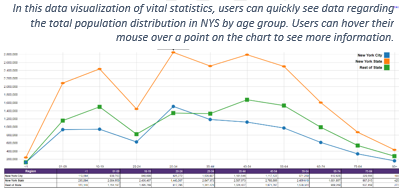
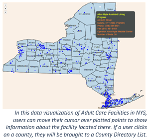
With funding from the US Department of Health and Human Services, Centers for Medicare and Medical Services, CTG UAlbany used this process with the NYS Department of Health (NYS DOH) to take multiple open health datasets, such as statistics on health insurance plans, health care services, adult day services, and birth and death records, and transform them into easy-to-understand visualizations.
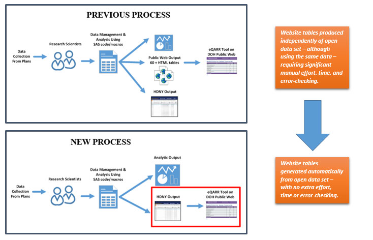
In one case, as shown in the next diagram, NYS DOH ended up saving 1-2 months of full-time employee (FTE) effort for their research scientists and 1-2 weeks of FTE effort for their Public Web team.
These savings were based on the time it took NYS DOH staff to recreate numerous (60+) web-based tables of data that were already published in their open data set.
See NYS DOH’s eQARR visualization tool created through this project:
- https://www.ctg.albany.edu/projects/dohdatavisualizations
- https://www.health.ny.gov/health_care/managed_care/reports/eqarr/
Once CTG UAlbany partners with an agency or organization, the following work begins:
Data Forensics
- Determine if the data is accurate, consistent, complete, and appropriately structured.
- If the data is not “visualization-ready,” CTG will investigate why – and recommend ways to fix it.
- CTG creates initial visualizations to see how well the code and data align.
Assess and Analyze User Needs & Expectations
- Qualitative research to determine if the visualizations meet needs and expectations.
- Interviews conducted to understand how users are using the data.
- Determine changes that need to be made to datasets and/or the code.
Piloting & Implementation
- CTG demos the visualizations to gather feedback and refine the code and visualizations.
- Partners receive the standardized, fully documented, open-source code.
- Partners also receive tools, such as data dictionaries, from CTG.